Alert examples
Types
Custom alert: Custom alert title
Info alert: Info alert title
Success alert: Success alert title
Warning alert: Warning alert title
Danger alert: Danger alert title
Variations
Success alert: Success alert title
Success alert description. This should tell the user more information about the alert.
Success alert: Success alert title
Success alert description. This should tell the user more information about the alert. This is a link.
Success alert: Success alert title
Success alert: Success alert title
Success alert: Success alert title
Success alert: Lorem ipsum dolor sit amet, consectetur adipiscing elit. Curabitur pellentesque neque cursus enim fringilla tincidunt. Proin lobortis aliquam dictum. Nam vel ullamcorper nulla, nec blandit dolor. Vivamus pellentesque neque justo, nec accumsan nulla rhoncus id. Suspendisse mollis, tortor quis faucibus volutpat, sem leo fringilla turpis, ac lacinia augue metus in nulla. Cras vestibulum lacinia orci. Pellentesque sodales consequat interdum. Sed porttitor tincidunt metus nec iaculis. Pellentesque non commodo justo. Morbi feugiat rhoncus neque, vitae facilisis diam aliquam nec. Sed dapibus vitae quam at tristique. Nunc vel commodo mi. Mauris et rhoncus leo.
This example uses ".pf-m-truncate" to limit the title to a single line and truncate any overflow text with ellipses.
Success alert: Lorem ipsum dolor sit amet, consectetur adipiscing elit. Curabitur pellentesque neque cursus enim fringilla tincidunt. Proin lobortis aliquam dictum. Nam vel ullamcorper nulla, nec blandit dolor. Vivamus pellentesque neque justo, nec accumsan nulla rhoncus id. Suspendisse mollis, tortor quis faucibus volutpat, sem leo fringilla turpis, ac lacinia augue metus in nulla. Cras vestibulum lacinia orci. Pellentesque sodales consequat interdum. Sed porttitor tincidunt metus nec iaculis. Pellentesque non commodo justo. Morbi feugiat rhoncus neque, vitae facilisis diam aliquam nec. Sed dapibus vitae quam at tristique. Nunc vel commodo mi. Mauris et rhoncus leo.
This example uses ".pf-m-truncate" and sets "--pf-v6-c-alert__title--max-lines: 2" to limit title to two lines and truncate any overflow text with ellipses.
Inline types
Custom inline alert: Custom inline alert title
Info alert: Info inline alert title
Success alert: Success inline alert title
Warning alert: Warning inline alert title
Danger alert: Danger inline alert title
Inline variations
Success alert: Success alert title
Success alert description. This should tell the user more information about the alert.
Success alert: Success alert title
Success alert description. This should tell the user more information about the alert. This is a link.
Success alert: Success alert title
Success alert: Success alert title
Alert group examples
Static alert group
An alert group is optional when only one static alert is needed. It becomes required when more than one alert is used in a list.
-
Success alert: Success alert title
-
Danger alert: Danger alert title
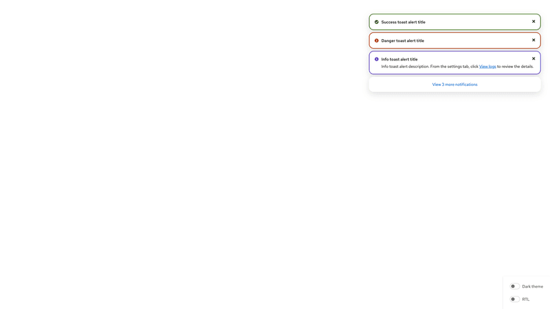
Toast alert group
An alert group is required to display toast alerts. An alert group that includes the .pf-m-toast modifier becomes a toast alert group with unique positioning in the top-right corner of the window.
Every toast alert must include a close button to dismiss the alert.
When toast alerts include a link or action, these elements are not announced as interactive elements by screen readers. Whenever you include a link or button, incorporate it into the message so that it’s clear to the user how to access the same contents or action without clicking the link or button directly in the toast. For example, if your toast alert displays a message “The build is complete. Go to the Builds page to download,” the screen reader user is given instructions on how to find their build for download.
For sighted users, interactive elements can be included in this message in one of the following ways:
- Using a link to the Builds page: "The build is complete. Go to the Builds page to download" using
<a href="#">Builds</a> - Using a button to download: "The build is complete. Go to the Builds page to " using
<button class="pf-v6-c-button pf-m-link pf-m-inline type="button">download</button>
Documentation
Alert overview
Add a modifier class to the default alert to change the color: .pf-m-success, .pf-m-danger, .pf-m-warning, or .pf-m-info.
Alert usage
Class | Applied to | Outcome |
|---|---|---|
.pf-v6-c-alert | <div> | Initiates the alert component. Always use with a status modifier class. Required |
.pf-v6-c-alert__toggle | <div> | Defines the expandable alert toggle icon. Required for expandable alerts |
.pf-v6-c-alert__toggle-icon | <span> | Defines the expandable alert toggle icon. Required for expandable alerts |
.pf-v6-c-alert__icon | <div> | Defines the alert icon. Required |
.pf-v6-c-alert__title | <p>, <h1-h6> | Defines the alert title. Required |
.pf-v6-c-alert__description | <div> | Defines the alert description area. |
.pf-v6-c-alert__action | <div> | Defines the action button wrapper. Should contain .pf-v6-c-button.pf-m-plain for close action or .pf-v6-c-button.pf-m-link for link text. It should only include one action. |
.pf-v6-c-alert__action-group | <div> | Defines the action button group. Should contain .pf-v6-c-button.pf-m-link.pf-m-inline for inline link text. Note: only inline link buttons are supported in the alert action group. |
.pf-m-custom | .pf-v6-c-alert | Applies custom status styling. |
.pf-m-success | .pf-v6-c-alert | Applies success status styling. |
.pf-m-danger | .pf-v6-c-alert | Applies danger status styling. |
.pf-m-warning | .pf-v6-c-alert | Applies warning status styling. |
.pf-m-info | .pf-v6-c-alert | Applies info status styling. |
.pf-m-inline | .pf-v6-c-alert | Applies inline styling. |
.pf-m-plain | .pf-v6-c-alert.pf-m-inline | Applies plain styling to an inline alert. |
.pf-m-expandable | .pf-v6-c-alert | Applies expandable styles to the alert. |
.pf-m-expanded | .pf-v6-c-alert.pf-m-expandable | Applies expanded styles to an expandable alert. |
.pf-m-truncate | .pf-v6-c-alert__title | Modifies the title to display a single line and truncate any overflow text with ellipses. Note: you can specify the max number of lines to show by setting the --pf-v6-c-alert__title--max-lines (the default value is 1). |
Alert group overview
The alert component is used to contain and align consecutive alerts. Alert groups can either be embedded alongside a page's content or in the top-right corner as a toast group using the .pf-m-toast modifier.
Alert group usage
Class | Applied to | Outcome |
|---|---|---|
.pf-v6-c-alert-group | <ul> | Creates an alert group component. Required |
.pf-v6-c-alert-group__item | <li> | Creates an alert group item. Required |
.pf-v6-c-alert-group__overflow-button | <button> | Applies overflow button styling to an alert group overflow button. |
.pf-m-toast | .pf-v6-c-alert-group | Applies toast alert styling to an alert group. |
CSS variables
Prefixed with 'pf-v6-c-alert'
| Expand or collapse column | Selector | Variable | Value | |
|---|---|---|---|---|
| .pf-v6-c-alert | --pf-v6-c-alert--BoxShadow | 0px
10px
20px
0px
rgba(41, 41, 41, 0.1500) | ||
| ||||
| .pf-v6-c-alert | --pf-v6-c-alert--BackgroundColor | (In light theme) #ffffff | ||
| ||||
| .pf-v6-c-alert | --pf-v6-c-alert--GridTemplateColumns | max-content 1fr max-content | ||
| .pf-v6-c-alert | --pf-v6-c-alert--GridTemplateAreas | "icon title action"
". description description"
". actiongroup actiongroup" | ||
| .pf-v6-c-alert | --pf-v6-c-alert--BorderWidth | 2px | ||
| ||||
| .pf-v6-c-alert | --pf-v6-c-alert--BorderColor | transparent | ||
| .pf-v6-c-alert | --pf-v6-c-alert--BorderRadius | 16px | ||
| ||||
| .pf-v6-c-alert | --pf-v6-c-alert--PaddingBlockStart | 1rem | ||
| ||||
| .pf-v6-c-alert | --pf-v6-c-alert--PaddingInlineEnd | 1rem | ||
| ||||
| .pf-v6-c-alert | --pf-v6-c-alert--PaddingBlockEnd | 1rem | ||
| ||||
| .pf-v6-c-alert | --pf-v6-c-alert--PaddingInlineStart | 1rem | ||
| ||||
| .pf-v6-c-alert | --pf-v6-c-alert--FontSize | 0.875rem | ||
| ||||
| .pf-v6-c-alert | --pf-v6-c-alert__toggle--MarginBlockStart | calc(-1 * 0.5rem) | ||
| ||||
| .pf-v6-c-alert | --pf-v6-c-alert__toggle--MarginBlockEnd | calc(-1 * 0.5rem) | ||
| ||||
| .pf-v6-c-alert | --pf-v6-c-alert__toggle--MarginInlineStart | calc(-1 * 0.5rem) | ||
| ||||
| .pf-v6-c-alert | --pf-v6-c-alert__toggle--MarginInlineEnd | 0.5rem | ||
| ||||
| .pf-v6-c-alert | --pf-v6-c-alert__toggle-icon--Rotate | 0 | ||
| .pf-v6-c-alert | --pf-v6-c-alert__toggle-icon--TransitionTimingFunction | cubic-bezier(.4, 0, .2, 1) | ||
| ||||
| .pf-v6-c-alert | --pf-v6-c-alert__toggle-icon--TransitionDuration | 200ms | ||
| ||||
| .pf-v6-c-alert | --pf-v6-c-alert__icon--Color | (In light theme) #1f1f1f | ||
| ||||
| .pf-v6-c-alert | --pf-v6-c-alert__icon--MarginBlockStart | 0.25rem | ||
| .pf-v6-c-alert | --pf-v6-c-alert__icon--MarginInlineEnd | 0.5rem | ||
| ||||
| .pf-v6-c-alert | --pf-v6-c-alert__icon--FontSize | 0.875rem | ||
| ||||
| .pf-v6-c-alert | --pf-v6-c-alert__title--FontWeight | 500 | ||
| ||||
| .pf-v6-c-alert | --pf-v6-c-alert__title--Color | (In light theme) #151515 | ||
| ||||
| .pf-v6-c-alert | --pf-v6-c-alert__title--max-lines | 1 | ||
| .pf-v6-c-alert | --pf-v6-c-alert__action--MarginBlockStart | calc(0.5rem * -1) | ||
| ||||
| .pf-v6-c-alert | --pf-v6-c-alert__action--MarginBlockEnd | calc(0.5rem * -1) | ||
| ||||
| .pf-v6-c-alert | --pf-v6-c-alert__action--TranslateY | 0.125rem | ||
| .pf-v6-c-alert | --pf-v6-c-alert__action--MarginInlineEnd | calc(0.5rem * -1) | ||
| ||||
| .pf-v6-c-alert | --pf-v6-c-alert__description--PaddingBlockStart | 0.25rem | ||
| ||||
| .pf-v6-c-alert | --pf-v6-c-alert__action-group--PaddingBlockStart-base | 0.5rem | ||
| ||||
| .pf-v6-c-alert | --pf-v6-c-alert__action-group--PaddingBlockStart | 0.5rem | ||
| ||||
| .pf-v6-c-alert | --pf-v6-c-alert__description--action-group--PaddingBlockStart-base | 0.5rem | ||
| ||||
| .pf-v6-c-alert | --pf-v6-c-alert__description--action-group--PaddingBlockStart | 0.5rem | ||
| ||||
| .pf-v6-c-alert | --pf-v6-c-alert__action-group__c-button--not-last-child--MarginInlineEnd | 1rem | ||
| ||||
| .pf-v6-c-alert | --pf-v6-c-alert--m-custom--BorderColor | (In light theme) #147878 | ||
| ||||
| .pf-v6-c-alert | --pf-v6-c-alert--m-custom__icon--Color | (In light theme) #147878 | ||
| ||||
| .pf-v6-c-alert | --pf-v6-c-alert--m-custom__title--Color | (In light theme) #151515 | ||
| ||||
| .pf-v6-c-alert | --pf-v6-c-alert--m-success--BorderColor | (In light theme) #3d7317 | ||
| ||||
| .pf-v6-c-alert | --pf-v6-c-alert--m-success__icon--Color | (In light theme) #3d7317 | ||
| ||||
| .pf-v6-c-alert | --pf-v6-c-alert--m-success__title--Color | (In light theme) #151515 | ||
| ||||
| .pf-v6-c-alert | --pf-v6-c-alert--m-danger--BorderColor | (In light theme) #b1380b | ||
| ||||
| .pf-v6-c-alert | --pf-v6-c-alert--m-danger__icon--Color | (In light theme) #b1380b | ||
| ||||
| .pf-v6-c-alert | --pf-v6-c-alert--m-danger__title--Color | (In light theme) #151515 | ||
| ||||
| .pf-v6-c-alert | --pf-v6-c-alert--m-warning--BorderColor | (In light theme) #dca614 | ||
| ||||
| .pf-v6-c-alert | --pf-v6-c-alert--m-warning__icon--Color | (In light theme) #dca614 | ||
| ||||
| .pf-v6-c-alert | --pf-v6-c-alert--m-warning__title--Color | (In light theme) #151515 | ||
| ||||
| .pf-v6-c-alert | --pf-v6-c-alert--m-info--BorderColor | (In light theme) #5e40be | ||
| ||||
| .pf-v6-c-alert | --pf-v6-c-alert--m-info__icon--Color | (In light theme) #5e40be | ||
| ||||
| .pf-v6-c-alert | --pf-v6-c-alert--m-info__title--Color | (In light theme) #151515 | ||
| ||||
| .pf-v6-c-alert | --pf-v6-c-alert--m-inline--BackgroundColor | (In light theme) #ffffff | ||
| ||||
| .pf-v6-c-alert | --pf-v6-c-alert--m-inline--BoxShadow | none | ||
| .pf-v6-c-alert | --pf-v6-c-alert--m-inline--m-plain--BorderWidth | 0 | ||
| .pf-v6-c-alert | --pf-v6-c-alert--m-inline--m-plain--BackgroundColor | transparent | ||
| .pf-v6-c-alert | --pf-v6-c-alert--m-inline--m-plain--PaddingBlockStart | 0 | ||
| .pf-v6-c-alert | --pf-v6-c-alert--m-inline--m-plain--PaddingInlineEnd | 0 | ||
| .pf-v6-c-alert | --pf-v6-c-alert--m-inline--m-plain--PaddingBlockEnd | 0 | ||
| .pf-v6-c-alert | --pf-v6-c-alert--m-inline--m-plain--PaddingInlineStart | 0 | ||
| .pf-v6-c-alert | --pf-v6-c-alert--m-expandable--GridTemplateColumns | auto max-content 1fr max-content | ||
| .pf-v6-c-alert | --pf-v6-c-alert--m-expandable--GridTemplateAreas | "toggle icon title action"
". . description description"
". . actiongroup actiongroup" | ||
| .pf-v6-c-alert | --pf-v6-c-alert--m-expandable__description--action-group--PaddingBlockStart | 0.5rem | ||
| ||||
| .pf-v6-c-alert | --pf-v6-c-alert--m-expanded__toggle-icon--Rotate | 90deg | ||
| .pf-v6-c-alert | --pf-v6-c-alert--m-expanded__description--action-group--PaddingBlockStart | 0.5rem | ||
| ||||
| .pf-v6-c-alert.pf-m-custom | --pf-v6-c-alert--BorderColor | (In light theme) #147878 | ||
| ||||
| .pf-v6-c-alert.pf-m-custom | --pf-v6-c-alert__icon--Color | (In light theme) #147878 | ||
| ||||
| .pf-v6-c-alert.pf-m-custom | --pf-v6-c-alert__title--Color | (In light theme) #151515 | ||
| ||||
| .pf-v6-c-alert.pf-m-success | --pf-v6-c-alert--BorderColor | (In light theme) #3d7317 | ||
| ||||
| .pf-v6-c-alert.pf-m-success | --pf-v6-c-alert__icon--Color | (In light theme) #3d7317 | ||
| ||||
| .pf-v6-c-alert.pf-m-success | --pf-v6-c-alert__title--Color | (In light theme) #151515 | ||
| ||||
| .pf-v6-c-alert.pf-m-danger | --pf-v6-c-alert--BorderColor | (In light theme) #b1380b | ||
| ||||
| .pf-v6-c-alert.pf-m-danger | --pf-v6-c-alert__icon--Color | (In light theme) #b1380b | ||
| ||||
| .pf-v6-c-alert.pf-m-danger | --pf-v6-c-alert__title--Color | (In light theme) #151515 | ||
| ||||
| .pf-v6-c-alert.pf-m-warning | --pf-v6-c-alert--BorderColor | (In light theme) #dca614 | ||
| ||||
| .pf-v6-c-alert.pf-m-warning | --pf-v6-c-alert__icon--Color | (In light theme) #dca614 | ||
| ||||
| .pf-v6-c-alert.pf-m-warning | --pf-v6-c-alert__title--Color | (In light theme) #151515 | ||
| ||||
| .pf-v6-c-alert.pf-m-info | --pf-v6-c-alert--BorderColor | (In light theme) #5e40be | ||
| ||||
| .pf-v6-c-alert.pf-m-info | --pf-v6-c-alert__icon--Color | (In light theme) #5e40be | ||
| ||||
| .pf-v6-c-alert.pf-m-info | --pf-v6-c-alert__title--Color | (In light theme) #151515 | ||
| ||||
| .pf-v6-c-alert.pf-m-inline | --pf-v6-c-alert--BoxShadow | none | ||
| ||||
| .pf-v6-c-alert.pf-m-inline | --pf-v6-c-alert--BackgroundColor | (In light theme) #ffffff | ||
| ||||
| .pf-v6-c-alert.pf-m-plain | --pf-v6-c-alert--BorderWidth | 0 | ||
| ||||
| .pf-v6-c-alert.pf-m-plain | --pf-v6-c-alert--BackgroundColor | transparent | ||
| ||||
| .pf-v6-c-alert.pf-m-plain | --pf-v6-c-alert--PaddingBlockStart | 0 | ||
| ||||
| .pf-v6-c-alert.pf-m-plain | --pf-v6-c-alert--PaddingInlineEnd | 0 | ||
| ||||
| .pf-v6-c-alert.pf-m-plain | --pf-v6-c-alert--PaddingBlockEnd | 0 | ||
| ||||
| .pf-v6-c-alert.pf-m-plain | --pf-v6-c-alert--PaddingInlineStart | 0 | ||
| ||||
| .pf-v6-c-alert.pf-m-expandable | --pf-v6-c-alert--GridTemplateColumns | auto max-content 1fr max-content | ||
| ||||
| .pf-v6-c-alert.pf-m-expandable | --pf-v6-c-alert--GridTemplateAreas | "toggle icon title action"
". . description description"
". . actiongroup actiongroup" | ||
| ||||
| .pf-v6-c-alert.pf-m-expandable | --pf-v6-c-alert__description--action-group--PaddingBlockStart | 0.5rem | ||
| ||||
| .pf-v6-c-alert.pf-m-expanded | --pf-v6-c-alert__toggle-icon--Rotate | 90deg | ||
| ||||
| .pf-v6-c-alert.pf-m-expanded | --pf-v6-c-alert__description--action-group--PaddingBlockStart | 0.5rem | ||
| ||||
| .pf-v6-c-alert__description + .pf-v6-c-alert__action-group | --pf-v6-c-alert__action-group--PaddingBlockStart | 0.5rem | ||
| ||||
Prefixed with 'pf-v6-c-alert-group'
| Expand or collapse column | Selector | Variable | Value | |
|---|---|---|---|---|
| .pf-v6-c-alert-group | --pf-v6-c-alert-group__item--MarginBlockStart | 0.5rem | ||
| ||||
| .pf-v6-c-alert-group | --pf-v6-c-alert-group--m-toast--InsetBlockStart | 3rem | ||
| ||||
| .pf-v6-c-alert-group | --pf-v6-c-alert-group--m-toast--InsetInlineEnd | 2rem | ||
| ||||
| .pf-v6-c-alert-group | --pf-v6-c-alert-group--m-toast--MaxWidth | 37.5rem | ||
| .pf-v6-c-alert-group | --pf-v6-c-alert-group--m-toast--ZIndex | 600 | ||
| ||||
| .pf-v6-c-alert-group | --pf-v6-c-alert-group--m-toast__item--TransitionDuration--opacity--default | 200ms | ||
| ||||
| .pf-v6-c-alert-group | --pf-v6-c-alert-group--m-toast__item--TransitionTimingFunction--opacity--default | cubic-bezier(0, 0, .2, 1) | ||
| ||||
| .pf-v6-c-alert-group | --pf-v6-c-alert-group--m-toast__item--Transition--opacity--default | 200ms
cubic-bezier(0, 0, .2, 1)
0s | ||
| ||||
| .pf-v6-c-alert-group | --pf-v6-c-alert-group--m-toast__item--TransitionDuration--opacity | 200ms | ||
| ||||
| .pf-v6-c-alert-group | --pf-v6-c-alert-group--m-toast__item--TransitionTimingFunction--opacity | cubic-bezier(0, 0, .2, 1) | ||
| ||||
| .pf-v6-c-alert-group | --pf-v6-c-alert-group--m-toast__item--TransitionDelay--opacity | 0ms | ||
| ||||
| .pf-v6-c-alert-group | --pf-v6-c-alert-group--m-toast__item--TransitionDuration--transform | 400ms | ||
| ||||
| .pf-v6-c-alert-group | --pf-v6-c-alert-group--m-toast__item--TransitionTimingFunction--transform | cubic-bezier(0, 0, .2, 1) | ||
| ||||
| .pf-v6-c-alert-group | --pf-v6-c-alert-group--m-toast__item--TransitionDelay--transform | 0ms | ||
| ||||
| .pf-v6-c-alert-group | --pf-v6-c-alert-group--m-toast__item--TransitionDuration--grid-template-rows | 400ms | ||
| ||||
| .pf-v6-c-alert-group | --pf-v6-c-alert-group--m-toast__item--TransitionTimingFunction--grid-template-rows | cubic-bezier(0, 0, .2, 1) | ||
| ||||
| .pf-v6-c-alert-group | --pf-v6-c-alert-group--m-toast__item--TransitionDuration--margin-block | 400ms | ||
| ||||
| .pf-v6-c-alert-group | --pf-v6-c-alert-group--m-toast__item--TransitionTimingFunction--margin-block | cubic-bezier(0, 0, .2, 1) | ||
| ||||
| .pf-v6-c-alert-group | --pf-v6-c-alert-group--m-toast__item--c-alert--TransitionDuration | 400ms | ||
| ||||
| .pf-v6-c-alert-group | --pf-v6-c-alert-group--m-toast__item--c-alert--TransitionTimingFunction | cubic-bezier(0, 0, .2, 1) | ||
| ||||
| .pf-v6-c-alert-group | --pf-v6-c-alert-group--m-toast__item--c-alert--Transition | all
400ms
cubic-bezier(0, 0, .2, 1)
0s | ||
| ||||
| .pf-v6-c-alert-group | --pf-v6-c-alert-group--m-toast__item--m-offstage-right--TransitionDuration--opacity--default | 200ms | ||
| ||||
| .pf-v6-c-alert-group | --pf-v6-c-alert-group--m-toast__item--m-offstage-right--TransitionTimingFunction--opacity--default | cubic-bezier(.4, 0, .7, .2) | ||
| ||||
| .pf-v6-c-alert-group | --pf-v6-c-alert-group--m-toast__item--m-offstage-right--TransitionDelay--grid-template-rows--default | 200ms | ||
| ||||
| .pf-v6-c-alert-group | --pf-v6-c-alert-group--m-toast__item--m-offstage-right--TransitionDelay--margin-block--default | 200ms | ||
| ||||
| .pf-v6-c-alert-group | --pf-v6-c-alert-group--m-toast__item--m-offstage-right--c-alert--TransitionDelay--default | 200ms | ||
| ||||
| .pf-v6-c-alert-group | --pf-v6-c-alert-group--m-toast__item--m-offstage-right--TransitionDuration--transform | 300ms | ||
| ||||
| .pf-v6-c-alert-group | --pf-v6-c-alert-group--m-toast__item--m-offstage-right--TransitionTimingFunction--transform | cubic-bezier(.4, 0, .7, .2) | ||
| ||||
| .pf-v6-c-alert-group | --pf-v6-c-alert-group--m-toast__item--m-offstage-right--TransitionDuration--opacity | 300ms | ||
| ||||
| .pf-v6-c-alert-group | --pf-v6-c-alert-group--m-toast__item--m-offstage-right--TransitionTimingFunction--opacity | cubic-bezier(.4, 0, .7, .2) | ||
| ||||
| .pf-v6-c-alert-group | --pf-v6-c-alert-group--m-toast__item--m-offstage-right--TransitionDuration--margin-block | 100ms | ||
| ||||
| .pf-v6-c-alert-group | --pf-v6-c-alert-group--m-toast__item--m-offstage-right--TransitionTimingFunction--margin-block | cubic-bezier(.4, 0, .7, .2) | ||
| ||||
| .pf-v6-c-alert-group | --pf-v6-c-alert-group--m-toast__item--m-offstage-right--TransitionDelay--margin-block | 300ms | ||
| ||||
| .pf-v6-c-alert-group | --pf-v6-c-alert-group--m-toast__item--m-offstage-right--TransitionDuration--grid-template-rows | 300ms | ||
| ||||
| .pf-v6-c-alert-group | --pf-v6-c-alert-group--m-toast__item--m-offstage-right--TransitionTimingFunction--grid-template-rows | cubic-bezier(.4, 0, .7, .2) | ||
| ||||
| .pf-v6-c-alert-group | --pf-v6-c-alert-group--m-toast__item--m-offstage-right--TransitionDelay--grid-template-rows | 300ms | ||
| ||||
| .pf-v6-c-alert-group | --pf-v6-c-alert-group--m-toast__item--m-offstage-right--c-alert--TransitionDuration | 300ms | ||
| ||||
| .pf-v6-c-alert-group | --pf-v6-c-alert-group--m-toast__item--m-offstage-right--c-alert--TransitionTimingFunction | cubic-bezier(.4, 0, .7, .2) | ||
| ||||
| .pf-v6-c-alert-group | --pf-v6-c-alert-group--m-toast__item--m-offstage-right--c-alert--Transition | all
300ms
cubic-bezier(.4, 0, .7, .2)
300ms | ||
| ||||
| .pf-v6-c-alert-group | --pf-v6-c-alert-group__overflow-button--BorderWidth | 0 | ||
| .pf-v6-c-alert-group | --pf-v6-c-alert-group__overflow-button--BorderRadius | 16px | ||
| ||||
| .pf-v6-c-alert-group | --pf-v6-c-alert-group__overflow-button--PaddingBlockStart | 1rem | ||
| ||||
| .pf-v6-c-alert-group | --pf-v6-c-alert-group__overflow-button--PaddingInlineEnd | 1rem | ||
| ||||
| .pf-v6-c-alert-group | --pf-v6-c-alert-group__overflow-button--PaddingBlockEnd | 1rem | ||
| ||||
| .pf-v6-c-alert-group | --pf-v6-c-alert-group__overflow-button--PaddingInlineStart | 1rem | ||
| ||||
| .pf-v6-c-alert-group | --pf-v6-c-alert-group__overflow-button--Color | (In light theme) #0066cc | ||
| ||||
| .pf-v6-c-alert-group | --pf-v6-c-alert-group__overflow-button--BoxShadow | 0px
10px
20px
0px
rgba(41, 41, 41, 0.1500) | ||
| ||||
| .pf-v6-c-alert-group | --pf-v6-c-alert-group__overflow-button--BackgroundColor | (In light theme) #ffffff | ||
| ||||
| .pf-v6-c-alert-group | --pf-v6-c-alert-group__overflow-button--hover--Color | (In light theme) #004d99 | ||
| ||||
| .pf-v6-c-alert-group | --pf-v6-c-alert-group__overflow-button--hover--BackgroundColor | (In light theme) #f2f2f2 | ||
| ||||
| .pf-v6-c-alert-group | --pf-v6-c-alert-group__overflow-button--hover--BoxShadow | 0px
10px
20px
0px
rgba(41, 41, 41, 0.1500), 0px
20px
20px
-20px
rgba(41, 41, 41, 0.2000) | ||
| ||||
| .pf-v6-c-alert-group | --pf-v6-c-alert-group__overflow-button--focus--Color | (In light theme) #004d99 | ||
| ||||
| .pf-v6-c-alert-group | --pf-v6-c-alert-group__overflow-button--focus--BoxShadow | 0px
10px
20px
0px
rgba(41, 41, 41, 0.1500), 0px
20px
20px
-20px
rgba(41, 41, 41, 0.2000) | ||
| ||||
| .pf-v6-c-alert-group | --pf-v6-c-alert-group__overflow-button--active--Color | (In light theme) #004d99 | ||
| ||||
| .pf-v6-c-alert-group | --pf-v6-c-alert-group__overflow-button--active--BoxShadow | 0px
10px
20px
0px
rgba(41, 41, 41, 0.1500), 0px
20px
20px
-20px
rgba(41, 41, 41, 0.2000) | ||
| ||||
| .pf-v6-c-alert-group__item:hover | --pf-v6-c-alert-group__overflow-button--Color | (In light theme) #004d99 | ||
| ||||
| .pf-v6-c-alert-group__item:hover | --pf-v6-c-alert-group__overflow-button--BackgroundColor | (In light theme) #f2f2f2 | ||
| ||||
| .pf-v6-c-alert-group__item:hover | --pf-v6-c-alert-group__overflow-button--BoxShadow | 0px
10px
20px
0px
rgba(41, 41, 41, 0.1500), 0px
20px
20px
-20px
rgba(41, 41, 41, 0.2000) | ||
| ||||
| .pf-v6-c-alert-group__item:focus | --pf-v6-c-alert-group__overflow-button--Color | (In light theme) #004d99 | ||
| ||||
| .pf-v6-c-alert-group__item:focus | --pf-v6-c-alert-group__overflow-button--BoxShadow | 0px
10px
20px
0px
rgba(41, 41, 41, 0.1500), 0px
20px
20px
-20px
rgba(41, 41, 41, 0.2000) | ||
| ||||
| .pf-v6-c-alert-group__item:active | --pf-v6-c-alert-group__overflow-button--Color | (In light theme) #004d99 | ||
| ||||
| .pf-v6-c-alert-group__item:active | --pf-v6-c-alert-group__overflow-button--BoxShadow | 0px
10px
20px
0px
rgba(41, 41, 41, 0.1500), 0px
20px
20px
-20px
rgba(41, 41, 41, 0.2000) | ||
| ||||